
Product & Packaging Design
Autoclave Lids Product & Packaging Design for ATB Supermarket Chain
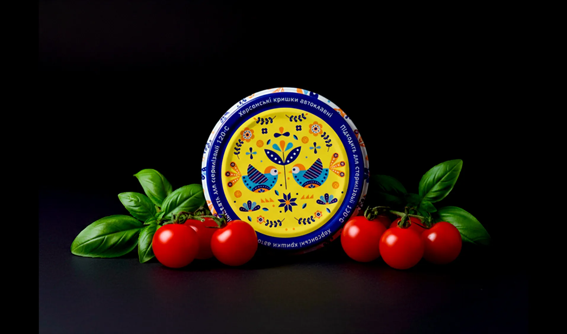
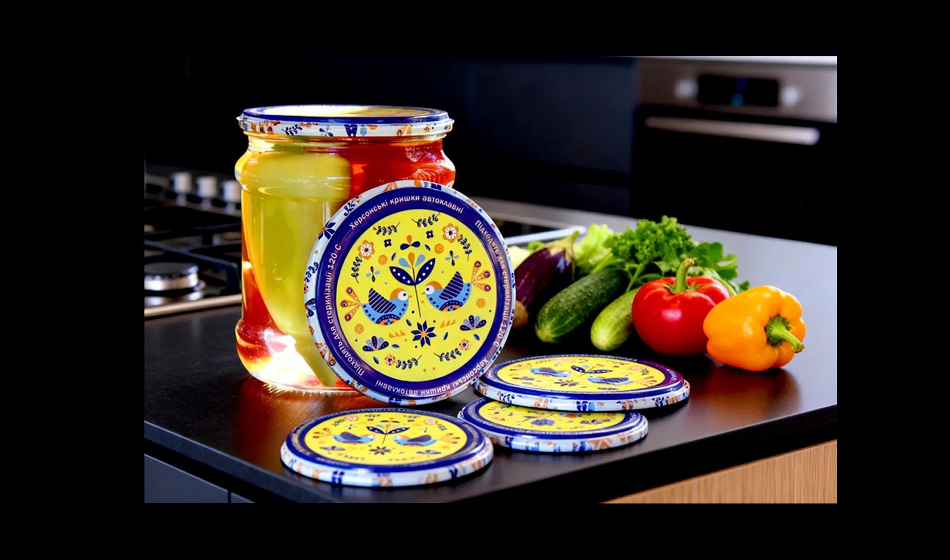
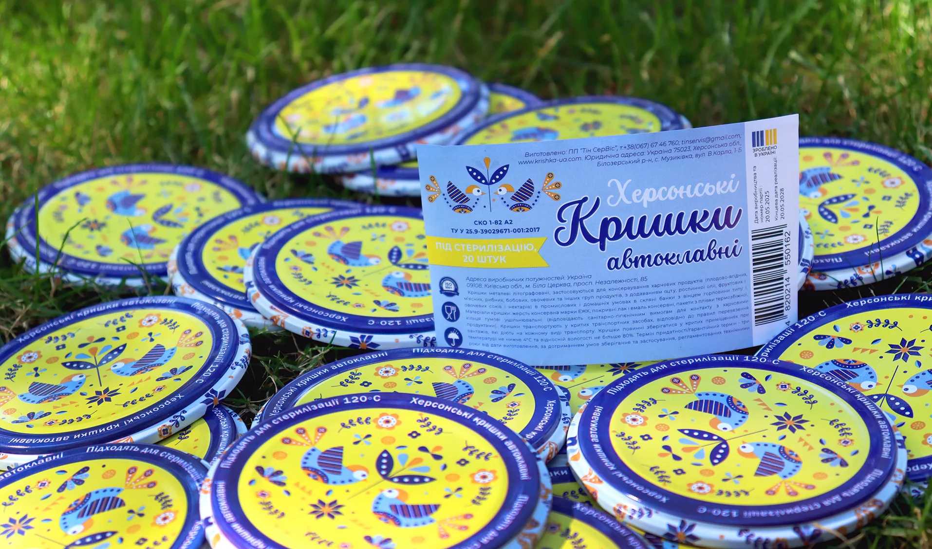
Bright and patriotic packaging design for autoclave lids created for ATB supermarket chain. The project combines full-color metal printing with bold visual accents to stand out on shelves and highlight national identity.
Challenge
To create a distinctive and vibrant design for autoclave lids and their packaging that would stand out on supermarket shelves and attract consumer attention. The design had to use patriotic colors to emphasize national identity, while maintaining a clean and modern visual style suitable for full-color metal printing.
Process
See More
Key stages included:
- Researched competitors’ packaging to identify visual gaps and opportunities for differentiation.
- Developed several color and layout concepts inspired by Ukrainian national motifs and modern minimalist trends.
- Focused on creating a dynamic composition with expressive contrasts and clear typography, ensuring readability on a reflective metal surface.
- Prepared detailed mockups for both product print design and packaging layout for production.
Result
The final branding is bold, youthful, and instantly recognizable.
The visual identity communicates creativity, confidence, and individuality. It stands out in the competitive coffee market and creates a strong emotional connection with the target audience.
Design for the Technic Smart Multicooker Series
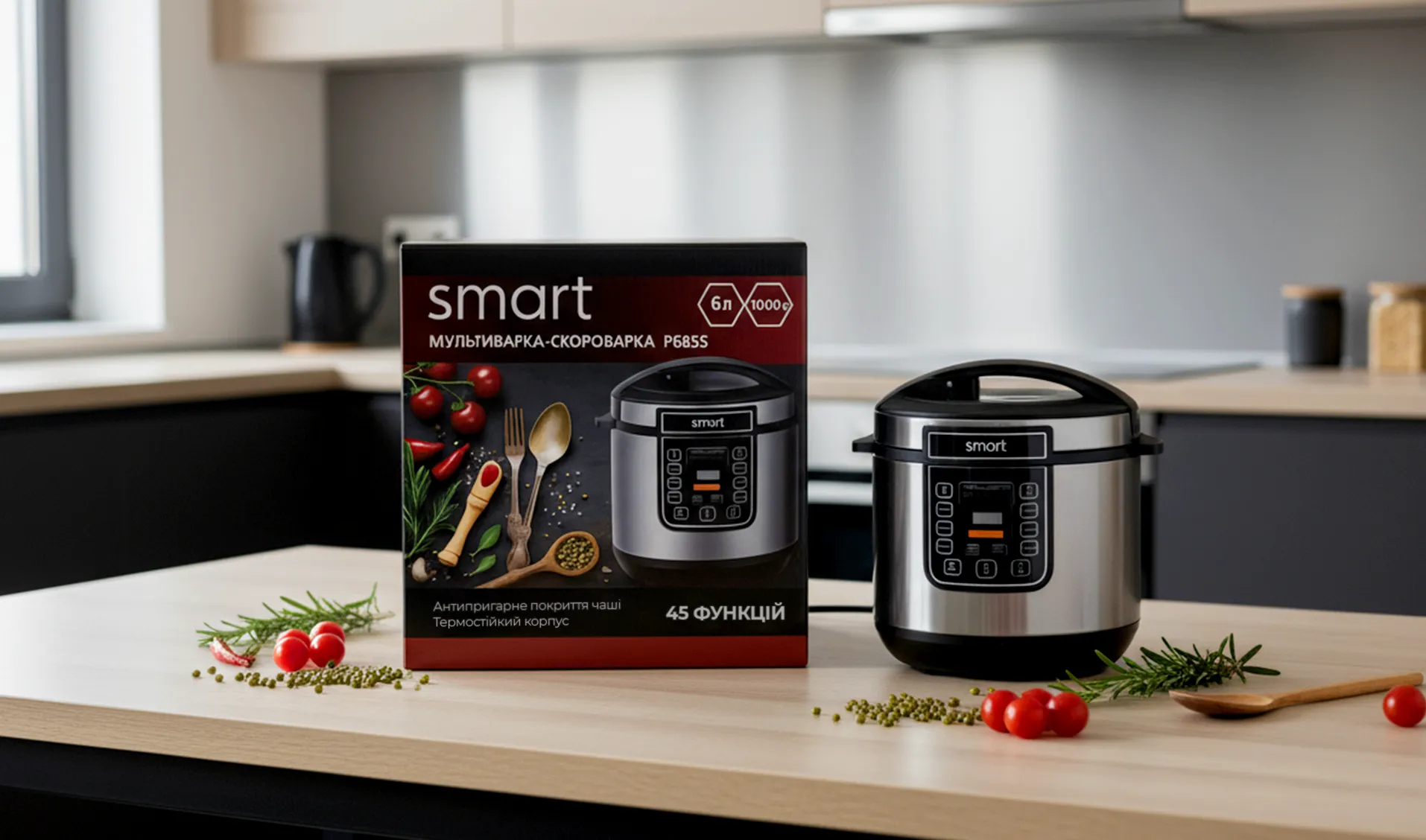
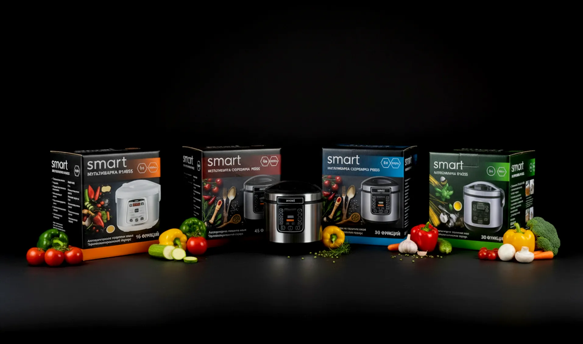
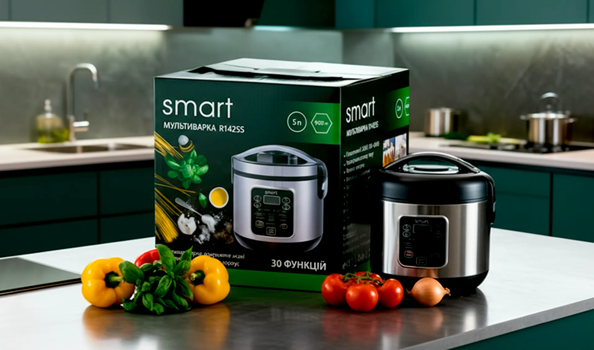
Elegant and “tasty” packaging design for the Technic Smart multicooker series. The project focuses on modern aesthetics, visual harmony, and creating a sense of trust in a new line of home appliances.
Challenge
To develop a visually appealing and premium-looking packaging design for a new line of Technic Smart multicookers. The goal was to create a design that looks “tasty,” modern, and trustworthy, standing out on the shelf while harmoniously fitting into the kitchen environment.
Process
See More
Key stages included:
- Conducted market analysis to identify packaging trends in the small home appliance segment.
- Defined a visual strategy emphasizing modern aesthetics, clarity, and emotional appeal.
- Selected a balanced color palette and elegant typography to communicate quality and reliability.
- Designed four cohesive yet distinctive boxes, ensuring consistency across the product line.
- Developed detailed mockups optimized for print production and brand presentation.
Result
The final packaging design reflects a modern and refined visual identity, helping the Technic Smart line appear premium and trustworthy. The “tasty” imagery and balanced composition attract attention, build consumer confidence, and enhance the product’s visibility both in stores and online.
Design for the Technic Smart Multifunctional Blender
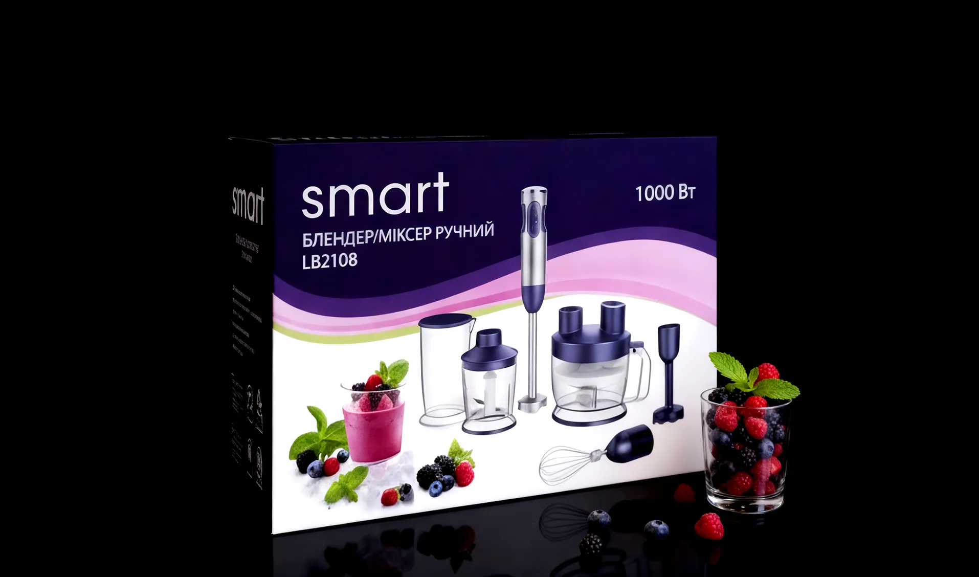
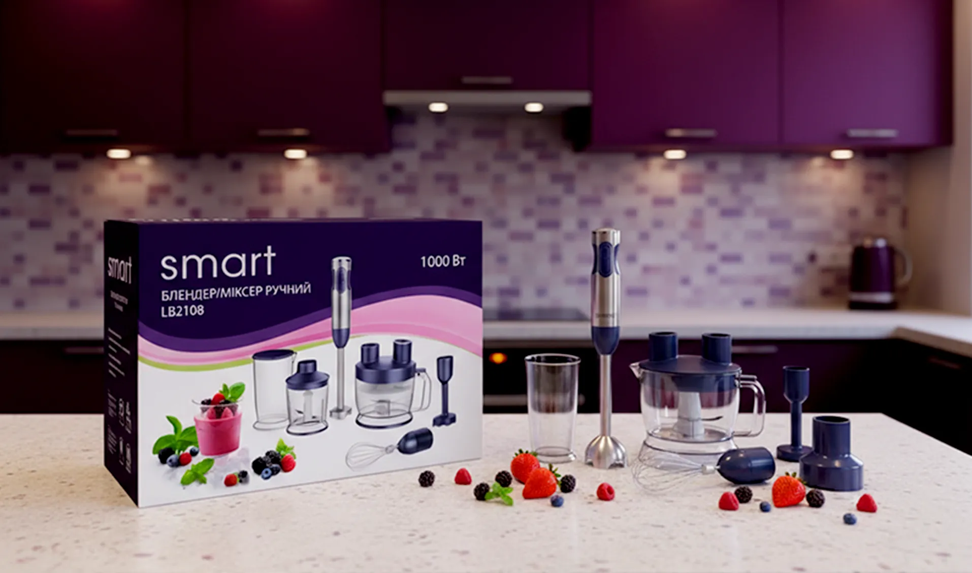
Modern and elegant packaging design for the Technic Smart multifunctional blender, highlighting innovation, quality, and the brand’s smart identity.
Challenge
To create a modern, stylish, and trustworthy packaging design for a new multifunctional blender under the Technic Smart brand. The goal was to highlight the product’s versatility and advanced technology while ensuring that the packaging looks attractive, premium, and visually consistent with the existing Technic Smart line.
Process
See More
Key stages included:
- Analyzed competitor packaging and identified design opportunities to emphasize functionality and innovation.
- Chose a clean, high-contrast color scheme and elegant typography to communicate quality and modernity.
- Integrated product imagery and infographics to visually convey the blender’s multifunctional features.
- Designed a composition that remains eye-catching both in-store and in online listings.
Result
The final design combines modern aesthetics and clear communication, reflecting the reliability and smart functionality of the product. The packaging effectively supports the Technic Smart brand identity, attracting attention and building consumer trust.
Packaging Design and Exhibition Booth Visuals for Mirobase Software Company
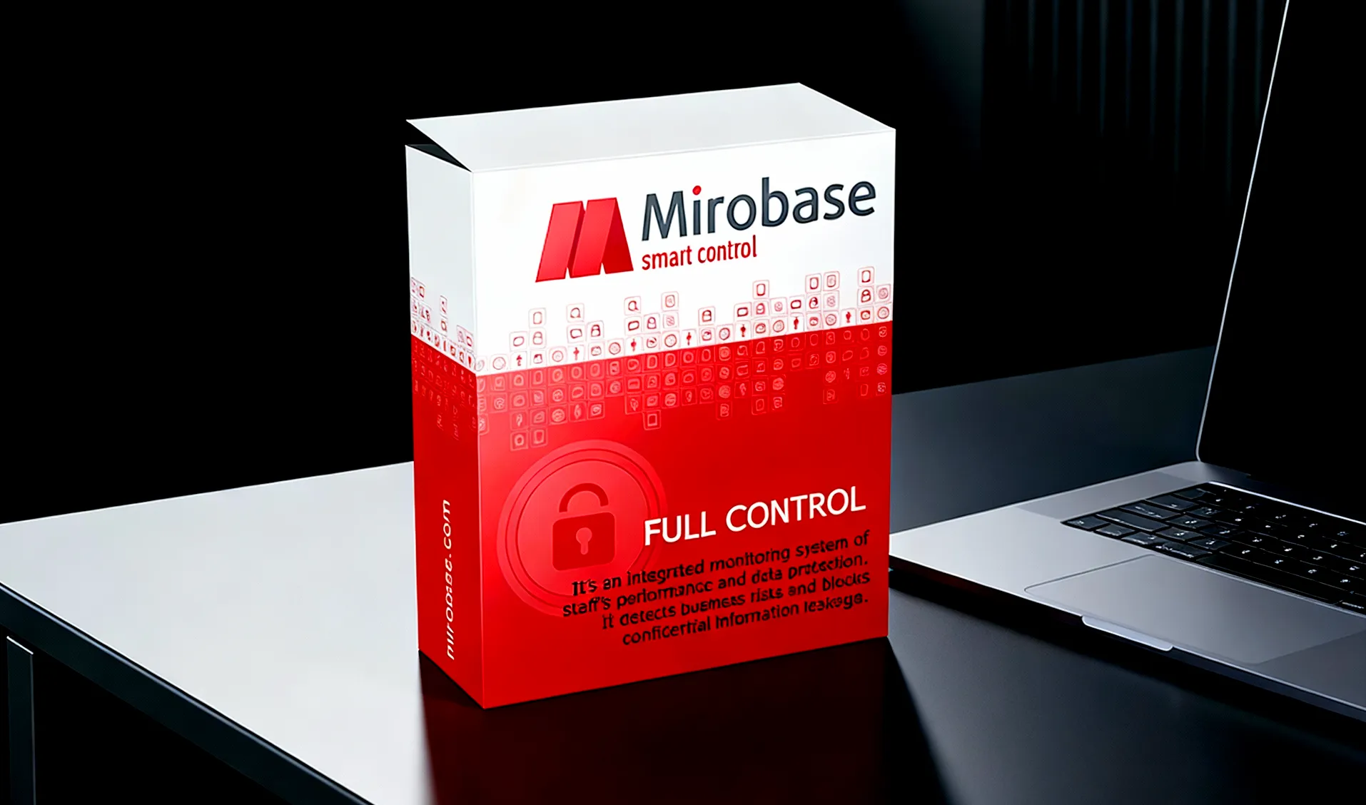
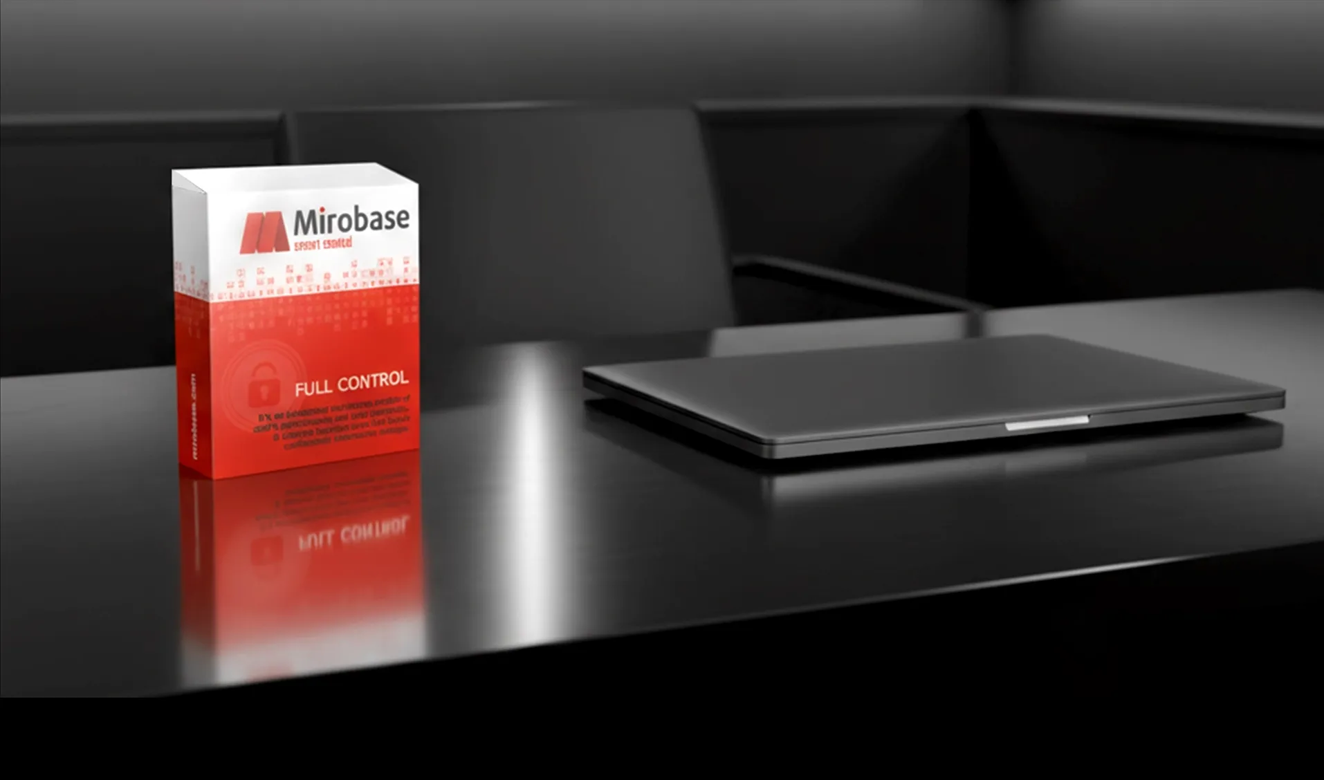
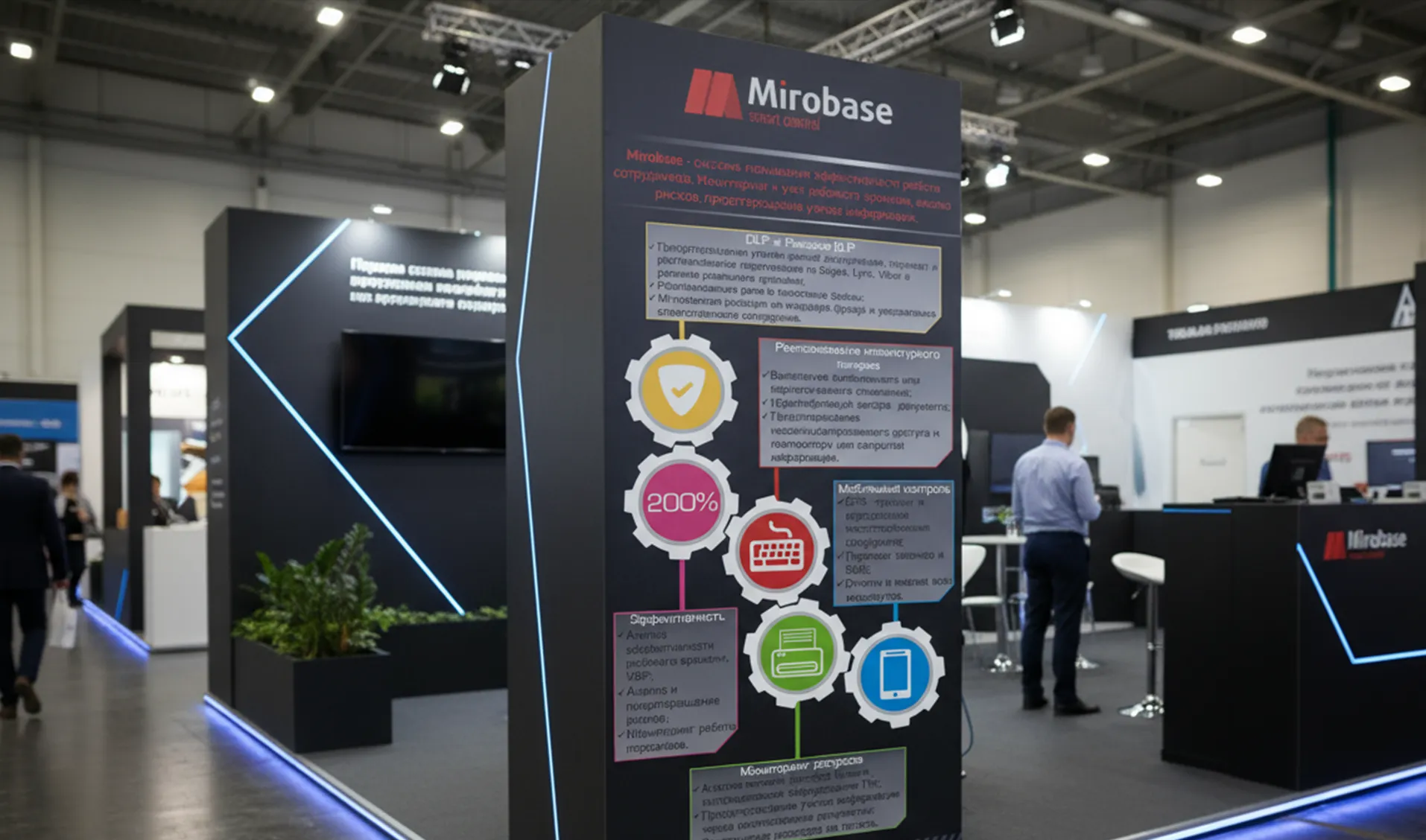
Clean and trustworthy packaging design for Mirobase employee monitoring software, reflecting security, control, and technological reliability through the brand’s visual identity.
Challenge
To develop a professional and trustworthy packaging design for a software product that monitors and analyzes employee performance. The main goal was to reflect the company’s core values — security, transparency, and technological reliability — through a clean and modern visual language. The design needed to incorporate the brand’s colors and logo, reinforcing corporate identity and recognition.
Process
See More
Key stages included:
- Studied the brand’s existing visual style and market positioning to ensure consistency across all communication materials.
- Developed several conceptual directions focused on trust, control, and protection, using geometric forms and subtle gradients to convey a sense of technology and precision.
- Applied the corporate color palette and logo elements to maintain strong brand association.
- Created a final design concept suitable for both physical packaging and digital presentation materials.
Result
The final packaging design conveys confidence in technology and reliability of control, perfectly aligning with Mirobase’s brand values. The clean composition, minimalistic typography, and use of brand colors create a sense of security and professionalism, enhancing customer trust and reinforcing the company’s image in the tech sector.
Label Design for the Khersonski Brand of Canning Lids

Unified label design for the Khersonski canning lids series — four cohesive labels created to enhance brand recognition through corporate typography and consistent visual identity.
Challenge
To create a cohesive and recognizable label design for a series of Khersonskie canning lids. The main goal was to develop a visual identity that strengthens brand recognition through the consistent use of corporate typography and a unified brand name, while maintaining a clean, appealing look suitable for mass production and retail display.
Process
See More
Key stages included:
- Analyzed existing market designs to identify ways to visually distinguish the Khersonski brand.
- Developed four label concepts within a single stylistic framework to ensure visual consistency across the product line.
- Applied the company’s corporate fonts, colors, and logo to build a strong and memorable brand identity.
- Focused on legibility, simplicity, and shelf appeal to make the design both functional and attractive.
Result
The final label series successfully conveys a unified and recognizable brand image, combining clarity, simplicity, and regional authenticity. The design highlights the product’s quality and helps the Khersonski brand stand out on store shelves.
Label Design for the Blumberg Brand of Paint Rollers
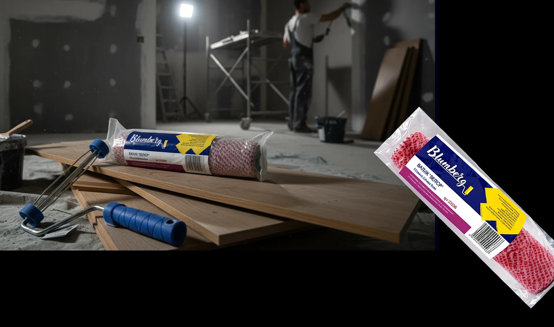
Bold and eye-catching label design for Bloomberg paint rollers, created to stand out through bright contrasts, dynamic composition, and strong brand presence.
Challenge
To create a memorable and eye-catching label design for Blumberg paint rollers. The goal was to develop a visual style that stands out on the shelf and immediately attracts attention, using bold contrasts and bright colors while keeping the design clear, professional, and aligned with the brand’s positioning.
Process
See More
Key stages included:
- Researched the market of construction and painting tools to identify the most effective visual strategies for shelf visibility.
- Developed several design concepts focusing on color contrast, geometric composition, and legibility.
- Chose a dynamic and vibrant color palette to reflect energy, precision, and product reliability.
- Refined typography and layout for a strong brand presence and easy product recognition.
Result
The final label design is bright, modern, and instantly recognizable, effectively differentiating the Blumberg brand from competitors. The combination of contrasting colors, clean typography, and dynamic layout makes the product stand out and enhances its appeal to consumers in retail environments.